Wednesday, October 11, 2017

VIOLET REVISITED

I wish I had a picture of my bedroom as a child.  It was a Mario Buatta-esque full canopy bed in purple chintz with matching chaise, framed by purple painted walls.  Denise even had a matching dress made for my favorite doll which sat on my perfectly purple, mini french desk chair.  It was a bedroom fit for a little princess and I was obsessed with it.  As an adult I never thought of incorporating this color into our work until recently.  Inspired by a few new clients we started envisioning a way to create sophisticated, feminine flair that wasn't pink.  Now we have two beautiful, chic rooms in this palette that we cannot wait to share.  Paired with gray or a lime green, it is an absolutely beautiful color.   Here are a few ways to incorporate this color in a minimal, subtle way..


Paint your walls!
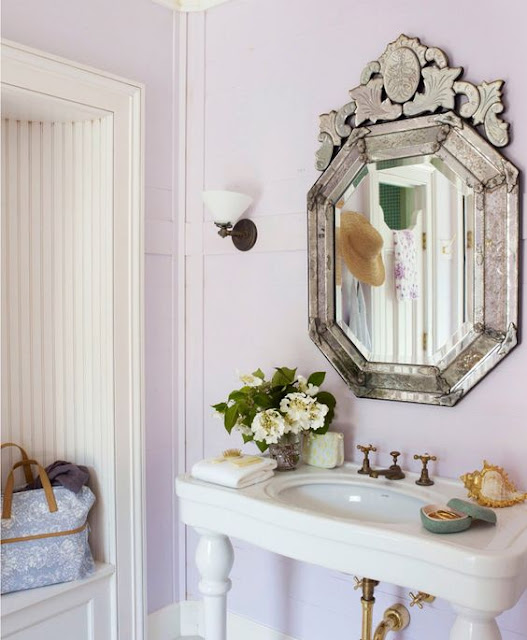
This bathroom in one of Aerin Lauder's homes is absolutely beautiful.  The lavender walls are almost white - the paint is muted down to the perfect shade.    Paired with dull brass fixtures and a classic venetian mirror, this bath is simply elegant.  Paint is easy and inexpensive to change, especially in a smaller space.  This is the perfect, non comital way to add a pop of color in your home. 


On your windows!
How fun is the above dining room?   The lavender panels are an amazing accent paired with traditional gracie wallpaper.  Using a color like purple on your windows adds a punch of unexpected color.


Accessorize!
Lacquered boxes or porcelain is an easy way to add an on trend color to any room in your home.  Spice up your bedside or living room end tables with a pop of purple.  


As an accent fabric!
We love an ikat... especially a colorful one.  If you don't see yourself fully upholstering a chair in a colorful fabric, throw pillows are an easy way to add color.  The above living room by Ashely Whitaker is a great example of such.

xo
Missy

Tuesday, September 5, 2017

IN WITH THE OLD, ADD TO THE NEW

We love simple, clean decor, but we also abide by the notion that your home needs to have a personality - it needs to be lived in and filled with accessories and colors that make you happy.  We usually like to add at least one piece of a "lived in" antique to every space no matter how modern it may be.  "In with the old, add to the new"... It always creates a sense of warmth and comfort.  Denise always decorated with armoires in years past.  It was almost a staple, but over the years they unfortunately became passé.  However, recently we have been loving the idea of bringing them back.  Below you can see why...

They are perfect for linen storage in a larger bathroom.  It is an easy way to add substance and elegance to an otherwise simple space.


If you don't have room in your bathroom, but do on your landing, why not have one there?  They are beautiful on their own, but when lined with our favorite monogrammed towels and bedding they become a showstopper - almost like artwork.


Or we just adore having using them without doors as a closet in your child's room.  We would take it a step further and paint the back a fun color ... just perfection.


Take our advice and add an element of old to your space.  You'll be surprised at how happy & new it makes you feel.   

xoxo

Wednesday, June 21, 2017

A MODERN APARTMENT

We love that people come to us for all style profiles - we currently have projects that reflect traditional, transitional & modern design.  One fun project we are working on is for a couple transitioning from a larger home on Long Island to a new, smaller apartment.  They are now closer to the action in New York City and they want the style of the apartment to reflect their more modern lifestyle.  They are ditching all of their family home's traditional furniture and are now going for a more clean look with pops of colors.  Here are some of our ideas so far.

Option 1:

This Milo Baughman-esque sofa is a cool take on a classic piece.  The brass legs are expected on a chair, but interesting and different on a sofa.  We would pair it with a pop of color on velvet accent chairs and a statement light fixture.  Lucite pieces are perfect for a small apartment because their transparency give the allusion of space.   I love this look personally because it is modern without feeling cold.


Option 2:

The client likes a yellowish / mustard accent color which we don't use often because like orange, yellow is not one of our favorites to work with.  This option gives hints of yellow without it overwhelming the palette.  Grey's work well with a modern space and different shades of it also create warmth here.  This console is great for an apartment because it is small and thin.  We would probably add a banana plant in the corner of this option.  Also, maybe a pair of upholstered x-benches in a small scale yellow pattern if the client wants more yellow involved.  


Rugs and paint color are tbd on both.
We'll keep you updated on this project on instagram with the hashtag #avalonGNproject

--xo--
M&D

Wednesday, May 3, 2017

MET GALA | THE REAL BEAUTY


The obvious choice for discussion with regards to the Met Gala would be the fashion.  Year after year the creativity and beauty really leaves me breathless.  However, this year I wasn't inspired by the dresses.  What really made me stop and stare were the tablescapes and flowers inside the coveted event.

Done by the renound Roul Avila, the decor was absolutely striking.  Above are a few inspirational shots via Vogue.  The style in its entirety is so us - the pinks, mixed with a modern take on traditional blue china and gold Chippendale chairs.  The sophisticated, but understated gold rimmed glasses, the delicate terra-cotta planters filled with pops of colorful florals.  That boxwood, floral wall?!!  I can't.  It is totally chic, but colorful and fun.  I absolutely love everything about it!

xo
Missy

Friday, April 21, 2017

AN APARTMENT KITCHEN

We are working with an adorable couple in New York City to renovate their new apartment.  We had already decorated their previous apartment so now our main focus is the bathrooms and kitchen.  Like most Manhattan apartments there is not a lot of space, but by opening it up a bit and focusing on a few key elements you can really make a smaller space seem larger.  Here are a few tips.


1.  Stick with the classics
When dealing with a small space we tend to go for classic shapes.  Stick with a shaker-esq cabinet.  If going for a modern feel go full shaker - which would be recessed paneled doors with clean lines (first two photo's above).  If you want a more classic vibe then add a little molding detail inset in the panel (last two photos).


2.  Focus on detail
Keep the overall lines clean, but focus on specific items where you can add character.  Above is a great example.  Stick with classic subway or carrara marble tiles, but add interest over your sink or stove by framing out a herringbone detail.   Also, choose hardware that is suited to your specific style - we love what was chosen in photo #2.


3.  Glass tiles can look chic
People have been choosing glass, colored tiles for a few years now, but the style can still work.  If done right, it can still look classic, but modern and clean.I would stay away from the blue that was popping up recently- go with clear or a light grey.  Paired with white cabinets it can really look beautiful.  Especially for a smaller kitchen in the city. 

I hope this is helpful!  We will post photo's of this kitchen's transformation over the next few weeks.  Check it out on instagram with the hashtag #lowermadisonproject

xx
missy

*all photos were taken from pinterest and I am unsure of the designers of each.

Tuesday, April 18, 2017

A FRESH, SPRING BEDROOM

With the Spring time weather finally here we wanted to let our readers know how we refresh our bedroom's for the season.  A bedroom should be a place that always makes you feel peaceful, comfortable and happy.  In those terms I would say that Spring is the season that most reflects the feeling of a bedroom.  With beautiful flowers in blooms, sunny long days and gorgeous weather it is the perfect time to make your bedroom feel inviting and warm again after a cold winter.  A few easy ways we perk up our bedroom's for Spring are:


1.  Clean, simple, but colorful bedding 
Your bedding should be everything.  It should be a reflection of your personality whether it be bold, calm, fun.  Whatever the case may be, at the start of Spring you should change it out for something new, something light and something pretty.  I am a huge fan of scalloped anything and bedding is the perfect way to showcase this detail.  The above set is expensive, but if you don't have a tremendous budget and just change out your pillow shams it still makes a huge difference.  Opt for a new set of standard and Euro shams.  For spring always choose white with a border in your favorite color.  Matouk, Frette & Leontine are obvious favorites, but you can browse Etsy for more affordable options.  Monogram them if you feel daring (we always do).  Paired with a less expensive pottery barn, organic white duvet cover (here) it is the perfect update for your bed.

2.  A light weight down duvet & throw
Speaking of duvets - your heavy, winter one should be a goner by now.  We purchase very expensive, quality comforters for clients and master bedrooms, but if your keeping it within a certain budget we love the ikea selection.  They have the perfect, super light weight comforter that we love for a guest room.  Also, for lounging you need the perfect light weight throw for the edge of your bed or draped over a chaise.  Leesa has a gorgeous one (pictured above).  The fabric is so soft and the neutral color goes with everything.  It also has one of my favorite details - stripes!  It is absolutely perfect for Spring.  Also, check out their amazingly comfortable lightweight mattresses.

3.  New bedside table accessories
Your winter months of colds are hopefully finally over so your monogrammed tissue holder and drawer full of cough drops should be put away for next year.  Opt for fun bamboo brass or silver frames and a new small vase filled with tulips.   Who doesn't want to wake up to fresh flowers?  Start your day with something that makes you happy.  Flowers always do it for me.  The above are both Aerin (of course).

4.  Monogrammed PJs
Lastly, I start every spring with a new pair of PJs.  Eberjay has the most comfortable pair and they are totally worth the money.   The color selection this year is perfect for Springtime and I always get them monogrammed at a local shop (because I clearly have a problem haha).

Four simple, easy ways to make your bedroom feel refreshed!
I hope you are enjoying this amazing, sunny day.

xoxo
missy

Friday, April 7, 2017

FRIDAY'S FAVORITES | KLISMOS CRAZY


The classic, Greek klismos chair has a very distinctive shape.  With its tapered legs and curved back there is no mistaking it.  Every couple of years it will make a revival and we are currently re-coveting this style.  We love them used as dining chairs around a traditional English table or in a larger scale, as an accent chair in a living room.   It adds a unique vibe.


Here are a few of our favorites.  We are using the top right chair in a blue linen for a kitchen.   They are so fun when upholstered in a colorful fabric or a mini print.  All to the trade only sources so contact us if you like any of the above.  

Have a great weekend!

xxx
M

Monday, April 3, 2017

SOUTHERN CHARM STYLE


Given that tonight is the premier of our favorite reality tv show, I thought I would dedicate today's designer notes to one of the most beautiful, Charleston.  The architectural history in downtown Charleston is the reason why it is considered one of the most charming cities in America.  One glance down any unique alleyway will bring a smile to your face.  Each home has a special characteristic, a bold color, a beautiful window box accented by tropical palmetto trees.  The streets are filled with numerous architectural styles from Federal to Victorian.  Even the occasional Greek Revival.  A common style is called the Charleston Single House.  It is uncommon in that it is narrower street side than at it's side.  It is the perfect style for the cities long, narrow lots.   One look at any of the above pictures and you realize that Charleston is an absolute. precious. gem.

Top 5 spots to check out in Charleston for the interior design obsessed:

1.  George C. Birlant & Company
 Specializing in gorgeous English antiques.

2.  Fritz Porter
A collection of unique antiques, mixed with modern pieces.

3.   Indigo Market
They have a slew of palm beach regency pieces - aka bamboo galore.

4.  Charleston Revisions
For a more mid century modern style - this store is your forte. 

5.  Hagan Fine Art Ga& Studio
Beautiful artwork by up and coming designers.


Lastly, we can't talk about Charleston without discussing the queen bee herself, Patricia Astchul. The above photos, featured in architectural digest, show her ridiculously fantastic home.  Decorated by our buddy Mario Buatta this Charleston estate is the definition of Southern Chic.  The rooms are filled with ornate detail - patterns are mixed and colors are bold.   It is over the top, loud and amazing - just like Patricia herself. 


If you haven't already, grab your martini and check out this season of Southern Charm - tonight on Bravo at 9pm.  If you are Southern Style obsessed like myself you will absolutely adore it.

xo 
m

Wednesday, March 29, 2017

CLIENT INSPIRATION | GUEST BATH DETAILS


For a meeting next week we have been trying to find inspiration for a more formal guest bath.  The vibe is a classic, traditional, yet chic look.  Our usual wallpaper look has been replaced with decorative, painted, maybe lacquered molding.  We are thinking about picture molding, maybe french inspired for the main guest bath on the first floor.  The formality and beauty of it will meld perfectly with the ornate limestone entry.  To pull this off you really need to work with a master carpenter.  Molding this detailed will look cheap and cheesy unless done perfectly.  The color is TBD, but I love the look of the above blues and grey.  Dove white is classic and warm, but paired with a Sherle Wagner sink (similar to the second photo above, but more ornate) we are thinking that a bold color pop is needed.  


For the second guest bath on the first floor we are also going with molding rather than wallpaper, but a more modern version.  The floor to ceiling square wainscoting above is perfect.  I really love the look of this second bathroom.  Each square has a little more detail and the added framework around the window and mirror is gorgeous.  Paired with the antique silver accents it is a timeless, but modern look.

Follow us on instagram at missy_minicucci & therinfretgroup for updated pictures of each projects.  The above will be hash tagged #kingspointproject and we will post photo's of each bathroom and their progress in the next few weeks.

xx
m&d

Friday, March 17, 2017

FRIDAY'S FAVORITES | LUCK OF THE IRISH


Happy St. Patrick's Day!  This holiday has always made me happy because it was a reminder of Spring being right around the corner.  Flowers blooming, longer days, sunshine and more time outside!  It's been a rough winter with a newborn so this year I am counting down the days until I can take long walks with her.   Above are some beautiful, inspirational St. Patty's Day inspired photo's which made me smile.   Below, are our Friday's Favorites featuring some fun green items.  Happy Friday!! It's 5:00 somewhere,  go have a drink :) 

xo
m


1.  Schumacher Panel
2. Parker Thatch Stationary
3.  Oomph Lantern
4.  Stubbs & Wooton Camo Slippers
5. MH Linens Monogrammed Napkins

Monday, March 6, 2017

A CHARITABLE SUNDAY


This weekend we participated in a wonderful event benefiting a local, Long Island charity.  A few interior designers were asked to decorate tabletops and auction off items for the Junior Welfare League of Huntington's "Camp for Kids".    For 25 years this charity has sent at risk children to summer camp- a happy, carefree time that people take for granted and every child should get to enjoy.  This charity brightens up the lives of many children so we wanted to brighten up the lives of everyone participating in the event yesterday.  That is why we chose the hot pink, white and grey color palette.  Above are some pictures from the set up for the event. 


Obsessed with these kiddies - clearly they were a big help - lol


We had custom placemats made for the event which came out better than we imagined.  Topped with Kate Spade dot dishes and obviously monogrammed napkins. Our flowers were simple - a glass, cylindrical vase in the center of the table with beautiful, white quince and a few, scattered orchids in small terra-cotta urns.  A grey and white large stripe tablecloth trimmed with a gorgeous, knotted samuel & son trim (also used as napkin holders). It was a simple, colorful, happy table - one of my favorites that we've ever done.  We couldn't have done it without Elite Tent & Party Rentals our party planning partners,  Scott & Amanda Schneider (their adorable kiddies are pictured above).  For the best kiddie outfits and outrageous mommy adventures check out Amanda's blog Amanda Beau & Co.

xo
m&d